Showing posts with label Felicity King. Show all posts

Friday, 16 December 2011

Death and attack scenes in TV&film


The idea of one of the attackers being a blonde “pretty” teenager is quite effective because it shows the audience to expect the unexpected. It is also is in an ordinary environment and the victim is supposed to be a team mate which further creates the idea of your own friends turning on you.


This scene is striking due to the contrast of the red blood on the white fence and how her ordinary clothes juxtapose the situation and give the impression she was going about her daily business.
This shot shows the woman frozen in fear and pain from the wound. The way the knife is positioned shows skill and precision which gives me the idea someone planned carefully to attack her in such a way.


:'(

Title Connotations

We did some research into the different titles and what they represent to help with chosing the most effective one.

Blood Box
This title is effective since it links well to the story aswell as having connotations with blood,and pain which are common elements in slasher films.

Shadows
This title doesnt link directly to the story line , but could link to the killer hiding amongst the shadows in the pit , the word shadows often is associated with secrecy and surprise.

Remote Death
This title links to the story line since , remote controls are associated with TVs but the word remote may be interpreted differently , but this can often be sorted by choosing appropriate typography. the title does give away there will be a death but is still quite mysterious beause it doesnt give any idea as to how it happens.

Blood Shed
This title doesnt not link to the story other than the fact it happens in a "shed" (garage) , but it is quite catchy and is a good play on words. the word title gives the idea of extreme pain and bleeding which would make it evident that it is a slasher.

Friday, 9 December 2011

Further analysis of typography


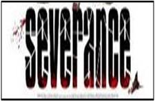
This is the title for a ‘slasher’ film called “Severance” the typography represents this by having the letters in a which gives the impression they themselves are ‘severed’. There also seems to be splatters of blood to show that the film will be quite gory. The black is used in a way which makes the red stand out, it is important that the red stands out since it seen as a colour which represents danger. The black also has the connotations of the unknown and dark goings on. The font being all in lower case letters creates a mood that there is not a sense of urgency  This typography is effective because it creates the appropriate mood, and tone considering what the film is about.
The typography in this title is similar to the typography in "Severance”  due to it also having what seems to be splatters of blood which most likely signifies death and injury  which is obviously a common theme in 'slashers'. The word “HOUSE” in the title being red could connote that the house is the source of danger in this film as red is most commonly associated with danger. Especially since all the other words are in white the audiences’ attention is drawn to that word primarily. The white amongst the red and black could suggest that there is not complete darkness and danger the font itself is in all capitals which seems to make it seem important as usually the most “important” words and letters are in capitals. The font is quite basic and not very modern and appears to be quiet commonly used which suggests that this film could be quite “normal” however this is juxtaposed by other features and shows that things which can seem quite ordinary such as house can have such unusual goings on.
( to be finished )
( to be finished )
( to be finished )

Film Title


To help us decide on the typography of our title at the start of our film opening we looked titles from the a list of  of recent “slasher” films we compiled to analyse the typography and fonts.
We noticed that the main colours used are red ,black and white. There are hardly any use of primary colours (excluding red) or bright colours. This is probably because they are associated with the genre of children’s films . The red is probably so commonly used due to its association with blood and danger. The colour black also has many connotations such as evil , and the unknown. White is also commonly used to juxtapose the dark goings on in the films since white is often seen as colour that represents , innocence and purity. A few of the titles have white writing on a black background which adds further contrast.
We also noticed there is a lot of use of shadows and blurred effects used on the font of the film titles. Shadows are an effective way to represent the unknown and often things going on without being noticed. shadows are often linked to paranoia because they are everywhere and horror films and slasher films like to create of feeling of not knowing what is going on or what or who is hiding amongst  the shadows. Blurriness has the connotations of not being fully aware of your surroundings or not being able to see properly , resulting in surprises often horrific ones. It also has connotations with drug and alcohol use and “being under the influence” which links to not being in full control or aware of your actions or surroundings which is familiar in horror movies for supernatural and horrific activity to ensue.

Wednesday, 7 December 2011

Recent "Slasher" films


1)My Bloody Valentine (2009)
2)Toolbox murders (2004)
3)Severance (2006)
4)Switchblade romance (2003)
5)Hatchet (2006)
6)Wrong Turn (2003)
7)House of Wax (2005)
8)Behind the Mask: The Rise of Leslie Vernon (2006)
9)Saw (2004)
10)Creep (2004)
11)Final destination (2000)
12)From Hell (2001)
13)The collector (2009)
14)The card player (2004)
15)Death Proof (2007)
16)House of 1000 corpses (2003)
17)The Devil’s Rejects (2005)
18)The Midnight Meat Train (2008)
19)The last house on  the left (2009)
20)Sorority row (2009)
21)The Strangers (2008)
22)Scream 3 (2000)

Tuesday, 22 November 2011

T.V

A lot of what is on our film opening will be what someone is viewing on a TV screen so I will research which TV set would be appropriate for genre ,purpose, and compliment appropriate mise en scene and the setting.

This is a picture of a television from a horror film called  'A Clockwork orange'.
Despite being made in 1971 it is intended to look fairly modern and futristic . there appears to be a head going into the TV and this is impossible. Since this is not possible it links to our film opening and its supernatural aspects as our televison tells the future.


This is a picture of a televison screen from a horror film called 'The Ring'.

It was filmed in 2002 at this time people were buying DVD's at this time but many still using VHS this shows that there was a chance they could have used a more modern TV but chose to use a more older looking one instead. this could be because of the connotations with old things and old things in horry movies. Horror movies usually associate old things with scary things such asa old houses being haunted. his is an example of a TV that is quite "normal" and these sort of TVs can be found in most houses across the world, this is an idea used across horror movies of creating fear out of everyday objects, however using an older TV would give the audience the impression that the TV itself has something special or supernaturaul about it. The screen is blank which could reperesent a malfunction or to create more focus on whats happening. This is another reason why we are intending to use an old television.


To help decide which type of tv set to use in our film opening we will compare modern and older televisons and evaluate them to work out which type would be more effective for us to use.


We have chosen to use an older style TV as our research has shown it will be more inriguing and create more suspense since it could evoke the idea it has a history behind it.
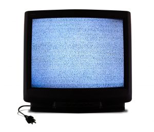
 Televison Static


Static can often create an uneasy feeling since it has many connotations and is often used in many horror movies for dramatic effect. An example of this is a film called "White Noise"  ( http://www.imdb.com/video/screenplay/vi1308426521/  )  static is shown on TV screen at some poinnt in the movie when the dead contact the living via "white noise". It symbolises interference in many ways for example spiritual interfence and electrical interference. The sound created by static can also help add to the tense,suspensful atmosphere desired. ( http://www.soundjay.com/tv-static-sound-effect.html  )

Thursday, 17 November 2011

Costume

Costume

Since the main character in our film is male we mainly focused on researching male characters from other horror/slasher films to evaluate.


This is a character from one of the final destination films.
He has a simple casual costume which can be seen as a stark contrast from the devastating events which would soon unfold. It gives the impression this character is laidback and not very formal. The clothes also give the impression that he is going about his daily business but then becames a victim since it is a crucial facot in horror movies that it could be anyone, maybe even yourself?


This is a picture of a character from one of the SAW films. His apron gives the impression he is the average working class male, which could increase the sympathy from the audience when he is a victim because he appears to be a normal guy . His plain white tshirt is quite effective since its does not distract from the action however a more patterned shirt could.


This a picture of two characters from final destination, the male is wearing a checkered shirt and jeans. Jeans are seen as casual wear and so are checkered shirts but the fact that his is tucked in gives a smarter look and that he put thought into what he was wearing ,however jeans and checkered shirts are items own and worn by a large amount of males which further subconsiously evokes the idea that this could happen to anyone. My group has decided in our film it would be preferable for our main character to wear plain clothing that is quite casual to keep te audience focused on the action as well as the fact that this a normal person. The female here appears to be wearing jeans or dark fited trousers , with  a floral like sheer shirt and is also not very casual and she also seems to have put thought into her outfit and paid attention to detail. both of their costumes create the idea that the seem to be going somewhere and was not fully expecting any disaster.


This is a picture of a character from one of the SAW films. He is wearing a blood covered plain smart shirt, with rolled up sleeves and creases. this shirt could suggest this character works as a proffesional of some sort. This further inforces the point about bad things happenig to anyone at any time.

Sunday, 13 November 2011

Existing Film research

We have compiled a short list of supernatural horror films that will help us develop and expand the opening of our film. We can analyse the typography, colours and images used in their posters to give us an insight into what makes a successful, supernatural horror.

·         Final Destination
 
The final Destination series were great examples of supernaturaol horrors. The poster uses a serif font, with a dark red colour. Naturally, the red symbolises all the blood and gore that is seen in the film. It also represents the evil presence of death and the supernatural ocurings. The font is clear, easy to read and stands out. The images used are dark in colour with shades of blue on the lightning strike. Blue represents the stress that the 'presence' is causing the victims and the mental and spiritual nightmares they are faced with.
·         Mirrors

Mirrors is another example of a supernatural horror. The poster uses similar typeography styles to Final Destination. A plain, serif font is used, red in colour, symbolising blood and death. An editing technique in used on the two 'R's' on the title. The second 'R' is reflected to represent the mirrors. The simple, yet clever technique automatically engages the readers interest into the poster. A dark background is used with a close up of face, pulling an expression of fear and terror, almost as if the mirrors have 'trapped' her. Although this person has an expression of evil and violence, the lighting is high angle, representing innocence and purity. This contrast may represent how innocent she was before and how the mirrors have trapped her in this evil spirit.
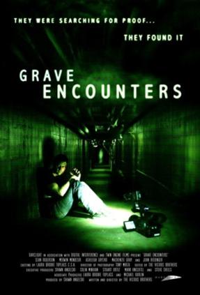
·         Grave Encounters

·        


Grave encounters uses evil spirits, enigma and examples of CCTV editing in the film. It would therefore pose as a great film to gain inspiration and ideas for our film. The poster uses a white sans serif font on a dark, eerie green background. It stands out and is easy to read. The dark green represents the eerie presence of the spirits in the film and the disturbance the characters are faced with.

  • 1408


1408 uses a fine detailed poster with outstanding special effects. The film is based around the supernatural occurings in a hotel room, room 1408 and the title of the film has been engraved onto the room key. Th font is in serif and although has been graphicaly engraved unt the key, has been kept simple and easy to read. A fiery red glow is seen on the background of the poster and surrounds the actors ands the key. This may reflect that the key leads to to all the violence and evil spirits in the film, i.e inside the room.

·         Paranormal Activity

Paranormal Activity uses a lot of examples of CCTV footage in the film and we would also like to see this used in our opening. The poster uses a CCTV style shot from the film. The poster is maily focused on this and makes the auience feel as if they are watching the couple in bed. The typeface used in red in colour to represent the fear and terror the spirit causes these two people and the font is similar to what we see on the CCTV. It simple and easy to read and looks as if it has been captured from old style computing fonts or typefaces.