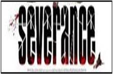
This is the title for a ‘slasher’ film called “Severance” the typography represents this by having the letters in a which gives the impression they themselves are ‘severed’. There also seems to be splatters of blood to show that the film will be quite gory. The black is used in a way which makes the red stand out, it is important that the red stands out since it seen as a colour which represents danger. The black also has the connotations of the unknown and dark goings on. The font being all in lower case letters creates a mood that there is not a sense of urgency This typography is effective because it creates the appropriate mood, and tone considering what the film is about.
The typography in this title is similar to the typography in "Severance” due to it also having what seems to be splatters of blood which most likely signifies death and injury which is obviously a common theme in 'slashers'. The word “HOUSE” in the title being red could connote that the house is the source of danger in this film as red is most commonly associated with danger. Especially since all the other words are in white the audiences’ attention is drawn to that word primarily. The white amongst the red and black could suggest that there is not complete darkness and danger the font itself is in all capitals which seems to make it seem important as usually the most “important” words and letters are in capitals. The font is quite basic and not very modern and appears to be quiet commonly used which suggests that this film could be quite “normal” however this is juxtaposed by other features and shows that things which can seem quite ordinary such as house can have such unusual goings on.
( to be finished )
( to be finished )
( to be finished )


No comments:
Post a Comment