Thursday 29 December 2011

Music

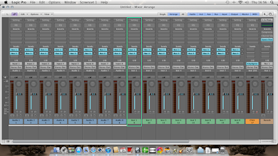
To create the music that shall be played over the top of our opening I shall use Logic Pro 9 in a 'Music for Picture' setting. 


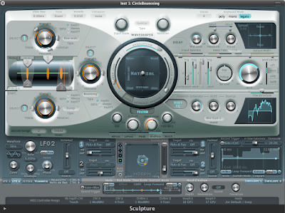
Using this software I can precisely play the sound and effects that will be heard as the film plays. I can then create dramatic and tense moments in the pinnacle of  action in our film using sound effects available on 'plug-ins' that can be found in Logic. The main 'Plug-in' I shall be using is 'Sculpture'. I can create surround sound effects such as atmospheric shimmers etc.


I shall use the plug-in, 'Sculpture' to create atmospheric SFX.


Friday 16 December 2011

Killer's Costume

In most scary films you do not see the killers face, unless it is grotesque or covered with a mask. We thought we would ensure that our killer's face is not revealed during our 2 minute opening, therefore he is going to wear a black hooded jumper. The hood will be up creating shadows over his face and also hiding it from view. Although generally he will have his back to the camera. We have used the colour black to show the darkness within him so our killer wears mostly black or dark colours. It will connotes the fear people have of the unkown and retains that sense of mystery, and creates an enigma. It also provides a stark contrast between the costume of the victim who is wearing white and other similar light colours.


The killer will be wearing dark jeans to enforce the view of him being able to disappear and shows again that darkness within him. Similar to the ones pictured below. Also the killer will be wearing clothes that enable him to blend in, meaning he could be anyone, they hide his indentity to a certain extent.

Death and attack scenes in TV&film


The idea of one of the attackers being a blonde “pretty” teenager is quite effective because it shows the audience to expect the unexpected. It is also is in an ordinary environment and the victim is supposed to be a team mate which further creates the idea of your own friends turning on you.


This scene is striking due to the contrast of the red blood on the white fence and how her ordinary clothes juxtapose the situation and give the impression she was going about her daily business.
This shot shows the woman frozen in fear and pain from the wound. The way the knife is positioned shows skill and precision which gives me the idea someone planned carefully to attack her in such a way.


:'(

Title Connotations

We did some research into the different titles and what they represent to help with chosing the most effective one.

Blood Box
This title is effective since it links well to the story aswell as having connotations with blood,and pain which are common elements in slasher films.

Shadows
This title doesnt link directly to the story line , but could link to the killer hiding amongst the shadows in the pit , the word shadows often is associated with secrecy and surprise.

Remote Death
This title links to the story line since , remote controls are associated with TVs but the word remote may be interpreted differently , but this can often be sorted by choosing appropriate typography. the title does give away there will be a death but is still quite mysterious beause it doesnt give any idea as to how it happens.

Blood Shed
This title doesnt not link to the story other than the fact it happens in a "shed" (garage) , but it is quite catchy and is a good play on words. the word title gives the idea of extreme pain and bleeding which would make it evident that it is a slasher.
Friday 9 December 2011

Further analysis of typography


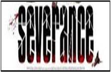
This is the title for a ‘slasher’ film called “Severance” the typography represents this by having the letters in a which gives the impression they themselves are ‘severed’. There also seems to be splatters of blood to show that the film will be quite gory. The black is used in a way which makes the red stand out, it is important that the red stands out since it seen as a colour which represents danger. The black also has the connotations of the unknown and dark goings on. The font being all in lower case letters creates a mood that there is not a sense of urgency  This typography is effective because it creates the appropriate mood, and tone considering what the film is about.
The typography in this title is similar to the typography in "Severance”  due to it also having what seems to be splatters of blood which most likely signifies death and injury  which is obviously a common theme in 'slashers'. The word “HOUSE” in the title being red could connote that the house is the source of danger in this film as red is most commonly associated with danger. Especially since all the other words are in white the audiences’ attention is drawn to that word primarily. The white amongst the red and black could suggest that there is not complete darkness and danger the font itself is in all capitals which seems to make it seem important as usually the most “important” words and letters are in capitals. The font is quite basic and not very modern and appears to be quiet commonly used which suggests that this film could be quite “normal” however this is juxtaposed by other features and shows that things which can seem quite ordinary such as house can have such unusual goings on.
( to be finished )
( to be finished )
( to be finished )

Film Title


To help us decide on the typography of our title at the start of our film opening we looked titles from the a list of  of recent “slasher” films we compiled to analyse the typography and fonts.
We noticed that the main colours used are red ,black and white. There are hardly any use of primary colours (excluding red) or bright colours. This is probably because they are associated with the genre of children’s films . The red is probably so commonly used due to its association with blood and danger. The colour black also has many connotations such as evil , and the unknown. White is also commonly used to juxtapose the dark goings on in the films since white is often seen as colour that represents , innocence and purity. A few of the titles have white writing on a black background which adds further contrast.
We also noticed there is a lot of use of shadows and blurred effects used on the font of the film titles. Shadows are an effective way to represent the unknown and often things going on without being noticed. shadows are often linked to paranoia because they are everywhere and horror films and slasher films like to create of feeling of not knowing what is going on or what or who is hiding amongst  the shadows. Blurriness has the connotations of not being fully aware of your surroundings or not being able to see properly , resulting in surprises often horrific ones. It also has connotations with drug and alcohol use and “being under the influence” which links to not being in full control or aware of your actions or surroundings which is familiar in horror movies for supernatural and horrific activity to ensue.

Wednesday 7 December 2011

Film Title.

We have been looking at possible titles for our film and have come up with a few ideas. We wanted our title to have connotations of the slasher nature our film entails but also have a supernatural edge, which our film also has. We also wanted to have a clue in the name as to what our film was about, for example title of the 2007 hit "Paranormal Activity" is pretty self explanatory and suggests what the film is about. We have come up with a list of possible ideas, such as: Remote Death, Ariel View, Blood Box, Playback, Premier and Death Watch. All of these titles relate to the main theme of our film which is watching your death through a TV. We have narrowed our choices down to Blood Box and Remote Death. Both can be related to our desired genre. To decide which film title is best or most popular we have created a poll to decide.
The options are:
Remote Death
Shadows
Blooh Shed
Ariel View
Blood Box.
Once the poll has closed and we have got the results we shall analyse them and see which was the most popular and whether it is most suitable.

So far, the majority of the votes we have are for the film to be called "Remote Death" with 8 votes out of 18, the least popular film title suggestion being "Blood Shed" with 1 vote.

Film production

To give our film a professional look and feel, we need to import a number of film producers' logo and introductions at the beginning.
After analysing a number of different films including the Saw sequels, we have found two suitable clips that we can import to our video.


New Line Cinema, often simply referred to as New Line, is an American film studio. It was founded in 1967 by Robert Shaye and Michael Lynne as a film distributor, later becoming an independent film studio. It became a subsidiary of Time Warner in 1996 and was merged with larger sister studio Warner Bros. in 2008.
New Line in responsible for the production of major films in Hollywood including 'Lord of the Rings'. This will give the impression that our film has been professionaly made.

Twisted Pictures is an independent production company, mainly creating films of the horror genre. The company was founded in 2004 by Evolution Entertainment's Mark Burg, Oren Koules and Gregg Hoffman. They are known for producing the Saw film series.
Being producers of horror films, Twisted pictures would suit our film perfectly.


Platinum Dune is a production company that works in the motion picture industry and was created in 2001 by filmmakers called Michael Bay, Brad Fuller, and Andrew Form. The institution is based in Los Angeles, California, USA. The firm specialises in horror films and would therefore be able to distribute our horror film successfully.


platinum-dunes.pngPlatinum Dunes has produced a number of different horror films such as:

  • Texas Chainsaw Massacre : The Beginning
  • The Unborn
  • Friday the 13th
  • Nightmare on Elm Street
  • The Hitcher etc.


Recent "Slasher" films


1)My Bloody Valentine (2009)
2)Toolbox murders (2004)
3)Severance (2006)
4)Switchblade romance (2003)
5)Hatchet (2006)
6)Wrong Turn (2003)
7)House of Wax (2005)
8)Behind the Mask: The Rise of Leslie Vernon (2006)
9)Saw (2004)
10)Creep (2004)
11)Final destination (2000)
12)From Hell (2001)
13)The collector (2009)
14)The card player (2004)
15)Death Proof (2007)
16)House of 1000 corpses (2003)
17)The Devil’s Rejects (2005)
18)The Midnight Meat Train (2008)
19)The last house on  the left (2009)
20)Sorority row (2009)
21)The Strangers (2008)
22)Scream 3 (2000)

Monday 5 December 2011

Title Fonts

We have collected a selection of fonts we could use as our title is shown on screen. We wanted a font that isnt too conventional, as in "cheesy" horror or "tongue-in-cheek". We would like a font that is simliar to one that is found on a typewriter and a digital font- possibly a mix between the two. We could possibly use fonts that have been used in telivision throught the years. An example of a font is shown on the BBC test card


This iconic picture was used throughout  tv history and was used in the TV series, 'Life on Mars'. This series was a supernatural drama and would be relevant towards our film opening.

We could also use a similar font to that used on the paranormal activity posters. The film was classed as a supernatural horror, the same genre as ours and would be a suitable and relevant font to use on our film.

The font used is a modified kautiva font. The font has been made red with some fill effects a black./ It has been diffused and a shadow of the same image has been produced next to it.

For our film we could modify a similar font to the paranormal activity poster and the bbc test in the style of paranrmal activity.

Thursday 1 December 2011

On set production

Whilst filming we captured a number of images to analyse as we went along. We positioned the victim near the pit where he would be laying after being murdered. We covered the floor and murder weapon, an axe, in blood. We poured it in such a way that it run down the side of the pit to where the killer was situated. This may represent the killer 'collecting' his victims in the pit in the form of blood. The dirtiness of the whole scene shows the killer's contempt for their victim as they are in weathered surroundings and gives an overall atmosphere of misery and dispair.


The contrast in this close up between the actor's pale skin and white shirt with the dark and dirty surroundings shows the innocence of the victim. also the lighting is angled in such a way so that the contortion of the body is very prominent, including the very sharp jaw line showing shadows to the underneath of the face. This connotes the reason behind the actual murder of the victim, although he is young and dressed in light clothing (white shirt - innocence) the shadows created by the positioning of the light shows a small dark side to him (i.e a small wrong decision they've made in life etc) and maybe a meaning to his death.


This long shot shows the full length of the body in a heap on the floor, giving the viewer a wider view of the surroundings, and the light focuses in on the victim


This mid shot really emphasizes the high contrast between light and dark, and the slight smile on the young boys face underlines innocence along with the white light and shirt. This joyful approach to the picture completely juxtaposes the total mess of blood and dirt - death. The bright light almost has connotations of "seeing the light" as if the boy is happy (hence the slight innocent smile) to have escaped the torture at last.


Applying make up

To create the scary and tense atmosphere for our film opening, we applied makeup to our victim. We did a number of tests on other people before applying to the main actor for best results.
We used fake blood, a mixture of honey, water, red food colouring and cornflower, coloured eyeshadow for the bruise effect, and oil. These all gave him appearance that he has sweaty, bloody and bruised-faced.
To give the impression that his face was 'cut' or flesh had been 'peeled' off, we added a mixture of vaseline and red food colouring together to produce the results.


Mise en Scene; Clothing

To create the appearance that the victim has been dragged and roughly handled in order for the killer to position him in the room, we weathered the clothing to make it appear so. We dragged the clothes across the grass and other parts of dirty ground to make it appear worn. The results are shown below. The white T-Shirt is perfect to show the stark contrast between the dazzling white and the murky darkness of the dirt that covers it.